The pattern is the letter
There is no plain cut. Every glyph is a heavy grotesk silhouette with the pattern worked all the way through it, so the texture is not decoration laid on top — take it away and there is no letter left.
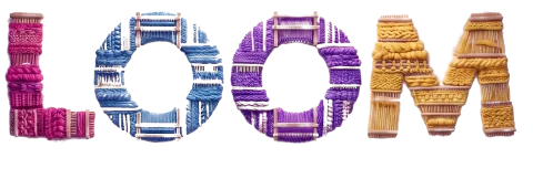
Four caps-only display cuts, drawn from scratch in our own type pipeline and not licensed from anyone. Each one is the same heavy grotesk silhouette with a different pattern worked through it — Organic's zebra ribbons, Retro's crackle mesh, Linear's hairline scribble, Flora's speckle and flowers — and each one is drawn twice: the pattern inside a solid letter, and the same pattern inside a hollow one. Eight faces, identical metrics, 98 glyphs apiece.
Caps only, by design — there is no lowercase drawn, so what you type is set as capitals. The slider stops at 40px: below that the pattern stops resolving and the letter goes with it.
Showing Organic Fill — pick another cut above.
The poster machine
Type a line, pick a cut, fill or outline, and a palette. The poster is drawn to a canvas from the live font — what you see is what downloads, at 1600 × 2000, free to print. Caps only, like the face.
There is no plain cut. Every glyph is a heavy grotesk silhouette with the pattern worked all the way through it, so the texture is not decoration laid on top — take it away and there is no letter left.
Every cut ships as a pair: the fill, where the pattern sits inside a solid letter, and the outline, where the same pattern sits inside a hollow one. Identical metrics — swap one for the other and nothing on the line moves.
Below roughly 40px the pattern stops resolving and the cut reads as a smudge. These are headline, poster and title faces — never body copy, never a caption, never a button.
Four cuts, eight faces
The family is one silhouette and four patterns, and each pattern is drawn twice — filled and hollow. The two lines in each card below are the same cut turned over, not two different fonts: the same widths, the same 98 glyphs, the same line length. What changes between the cards is how fine the pattern is cut — Organic's ribbons, Retro's mesh, Linear's hairline — and Flora, which scatters instead of weaving.
ORGANIC
ORGANIC
RETRO
RETRO
LINEAR
LINEAR
FLORA
FLORA
❀ ✿ ❦
98 glyphs · 161 codepoints · showing Organic Fill
Lowercase is mapped to these same capitals, which is the other 63 codepoints — it is not drawn separately, so it is not shown twice here.
@font-face {
  font-family: 'LOOM Organic';
  src: url('/fonts/loom-patterns/LOOMOrganic-Regular.woff2') format('woff2');
  font-display: swap;
}

h1 { font-family: 'LOOM Organic', sans-serif; }The web files run 29 KB (Organic) to 244 KB (Flora). Load the faces a page actually sets, not the family.
Free to use, embed and modify for personal and commercial work, print and screen. Don't resell the font files themselves or claim authorship of the typeface. Every outline in these files was drawn in LOOM's own type pipeline — no third-party font data is included. Full terms ship inside the zip.